January 27, 20212 Comments

Pitching design interactively – the options to present the design on multiple devices

I've looked into what are my options for live design presentation on multiple devices. Why did I need that? Well, I did because my clients want a 360 degree overview on how the product would look like on their customers' side. Reasonable, their revenue depends on that. So I always aim to present a comprehensive view of the design I've created, preferably with interactions offered to the client.

What are my options:

  • Developer toolbar's responsive preview
  • Browser add-ons
  • Free mobile site testers
  • Do my own thing

When do can I use a developer toolbar or a browser add-on for design preview?

Generally speaking, if I need to show the test result to internal people, colleagues or connection that is familiar with the product design process, these tools are fine. The view won't be too polished and there are technical setting but it doesn't have to be polished or comprehensive. They're quite convenient responsiveness testers for ongoing design or front-end development works, since I just grab the side of the panel and drag it left and right to change the responsive view. I can't expect pixel perfect accuracy, but during the development stage I don't really need to worry about accuracy. Basically, I just need to show how the layout and the responsive breakpoints correctly.

When can I use a free responsiveness testing tool?

After a certain point I need to be able to measure or have at least a grid view of the resolutions assigned to a certain device type to know what to correct and how to correct that in the layout. If I also want a quick look on different devices, rather than a flat screen sketch, I have several options for that, too, based on the purpose.

There are a few tools with rules for measuring, such as quirktools.com/screenflydesignmodo.com/responsive-test.

The most common mobile responsive testers with some form of device preview include ami.responsivedesign.isresponsivedesignchecker.com, websiteresponsivetest.comresponsive.pixeltuner.deresponsinator.com  and lab.maltewassermann.com/viewport-resizer/ with quick resize  still freely available.

What about premium responsive design tools?

There are two aspects of testing mobile responsive sites that require professional tools. One is usability and the other one is presentability. If you do design pitching often, you have to be able to do it very efficiently and in the appealing way. Professional tools give you the interface prepared for a quick and accurate responsive overview. For that stage the pixel density would useful to be applied to get an accurate responsive view. What is also very important for design responsiveness reviews and client presentations, but unfortunately rarely available, is the real device image applied around the screens that ensure accurate visual adjustment.

For an efficient mobile responsive test there is sizzy.co which is a mobile only responsive browser for developers. But I'm not a developer and I need the preview for client presentation.

That's how I got to do my own thing.

Basically me and some friends decided to pull off an interactive client presentation tool to share responsive design in an easy to understand and convincing manner.  That is ondevice.app, that makes our design pitch multi-device, literally.


August 12, 2019No Comments

The technical hurdles of creating proper responsive preview

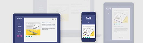
Creating responsive preview is all about seeing upfront what the clients would see when they check the otherwise responsively designed product on their own devices. The aim is to get as close as possible to the real life testing without building a device lab. Easier said then done. There are technicalities to consider, such as the followings:

    1. Pixel size

Checking mobile device previews on desktop can provide you with a slightly smaller or larger screen for the mobile devices in question than their real-life counterparts, depending on the physical pixel size of your monitor. Generally, larger display devices such as monitors and TVs have larger pixels and smaller display devices such as smart phones have smaller pixels.

The devices using smaller pixels produce higher quality or sharper images than those using larger pixels.

Let us examine our intuition about the relation of pixel size and image quality. Let's suppose, that we have created a user interface optimized to a resolution of 1920x1080 on our 21.5"LCD monitor, and we want to see, how it looks like on a tablet with a 10.6" screen, and on an LCD TV with a 60" screen, both capable to the same resolution, to ensure ourselves, that the design looks the same on all of these devices. We'll see, that our intuition in this case is indeed correct, and that the visual experience is quite different on these devices.

When it comes to ensuring the same visual experience, the truth is that we can pretty much have the same resolution, colors, and pixel layout, but not the same pixel size, nor the same display size.

  1. Device pixel ratio

The device pixel ratio is the value telling us how many pixels the device uses to display 1 reference pixel at the optimal viewing distance of the device. This value can be interpreted as the ratio of pixel sizes: the size of one CSS pixel to the size of one physical pixel." Let's take a closer look on these terms:

  • Reference pixel: "The visual angle of one pixel on a device with a pixel density of 96dpi and a distance from the reader of an arm’s length. For a nominal arm’s length of 28 inches, the visual angle is therefore about 0.0213 degrees. For reading at arm’s length, 1px thus corresponds to about 0.26 mm (1/96 inch)."
  • Physical pixel: this is the actual pixel used in the device screen.
  • CSS pixel: also referred to as "logical pixel", this is the size used in the definition of the reference pixel: 1/96 inch.

Most of the time, when we are tweaking CSS definitions, we can forget about the distance part of the reference pixel definition and focus on the CSS resolution, but have to keep in mind, that it is an important part of the definition.

Let's take a smartphone for example, with a device pixel ratio of 2. If we forget about the distance part of the reference pixel, it is easy to draw the false conclusion, that the size of 1 CSS pixel equals to the size of 4 (2 × 2) physical pixels, even though 1 CSS pixel is actually displayed with 4 physical pixels on the screen.

It can very well be, that the 4 pixels of the smartphone are still smaller than 1 CSS pixel, unless we move the smartphone to its optimal viewing distance.

  1. Resolution

The most common way to express the image quality called resolution. By definition the resolution is the number of distinct pixels that can be displayed horizontally and the number of distinct pixels that can be displayed vertically. By convention these two numbers are separated by the letter "x", e.g.: 1920x1080. We use these two numbers when we say that we "optimize the design to a certain resolution".

Knowing the device pixel ratio also helps us to calculate the resolutions (and thus the optimal break points) to which we want to optimize the design of product or website. This resolution is also referred to as the "CSS resolution", and can be calculated in both dimensions (width and height).

Let's suppose a smartphone has the resolution of 720 × 1200 and its device pixel ratio is 2, then the CSS resolution in both dimensions is calculated like the following:

Width: 720 ÷ 2 = 360; height: 1200 ÷ 2 = 600
CSS resolution = 360 × 600.

  1. Scrollbar width

The browsers are very different in interpreting the width of the targeted display area of the output device. Chrome and Safari exclude the scrollbar from the viewport width (the area inside the browser window) while Firefox, Opera and IE include the scrollbar dimensions. That makes Chrome’s viewport width being in fact 820px (800px body + 20px scrollbar) not 800px hence can trigger a different media query.

Not just during development, but also during the responsive preview it is important to control the scrollbar width to ensure that the media query breakpoints occur the same way they do on real devices.

  1. Browser inconsistency

When setting up the responsive preview, it's important to keep in mind that the default mobile browsers and the mobile versions of the most common browsers can be slightly different from their desktop counterparts in terms of applying style sheet declarations.

December 30, 2018No Comments

Responsive strategy 3: Mobile first or desktop first or element first

In the previous article of the Responsive strategy series, I've looked into what kind or responsive layout approaches are available for product or website, when would a fluid layout or adaptive layout or fixed layout be the best choice.


  1. Mobile first

A very focused approach that begins with designing for the main function and only then expand the functionalities for higher resolutions (often called progressive enhancement). It's a good choice if:

  • The number of mobile users is already 80% and above or 50%, but the sales are higher on mobile
  • The experience needs to be optimized for mobile and merely functional on desktop
  • The website/interface has only a few core features
  • The type of service/product is rather interactive (entertainment, life-style, networking, news etc.)


  1. Desktop first

This means designing for the highest specifications - the best achievable - and then going down to smaller resolutions (often called graceful degradation). It's a good choice if:

  • Visitor numbers and sales are higher on desktop
  • The website/interface is feature-rich, e.g. productivity, office or business tool
  • The experience needs to be highly refined on desktop and merely functional on mobile
  • The time and budget are limited, but patches are required for the existing product


  1. Element first

This approach is often referred as atomic design applied with a responsive mindset, and it enables the individual preparation of the interface elements so they behave responsively regardless of the layout. It's a good choice if:

  • The number of hits is close to equal on mobile and desktop or there are no initial user statistics
  • The website/interface is feature rich and complex and will expand gradually over time
  • Sufficient time and budget are available to build a future proof design system

With this Responsive strategy series, I've collected the main considerations around how to go about multi-device online presence. Knowing what factors to assess when preparing for a product or website development can save you from changing strategy afterwards, which is an extremely costly move.

October 13, 2018No Comments

Responsive strategy 2: Fluid layout or adaptive layout or fixed layout

In the previous article of the Responsive strategy series, I've discussed what aspect to assess when choosing the platform for your online presence, when would a native app or dedicated mobile site or responsive website be the best choice.

In this article I look into the options available to choose responsive layout for your product or website.


  1. Full responsive - Fluid

A fluid layout shows the content based on the available browser space by dynamically resizing the elements, regardless of the device or browser type. It's a good choice if:

  • No specific device type is targeted and 100% device compatibility is required
  • A large audience needs to be supported
  • User behaviour statistics and developer expertise are available for proper conceptualization


  1. Practical responsive - Adaptive

Changes the layout viewport width by viewport width, ensuring a more relevant content arrangement based on device type. A good choice if:

  • A more tailored solution is required for the user’s situational capabilities
  • There is a need to update the existing website but a complete rewrite is beyond the budget
  • Greater control is required over how the design will look on different devices


  1. Non-responsive - Fixed

The fixed approach uses one preset page size for all displays, which will be cut on smaller screens and scaled down on mobile devices, allowing the user to zoom in. It's a good choice if:

  • The business has no online sales, and a brochure-type web presence is enough
  • The website/interface is supposed to be used on a specific desktop screen
  • Full control and pixel perfect implementation are required for proper functionality


In the next article, I'll discuss the three dominant responsive development methods for a digital project to choose from.

August 22, 2018No Comments

Responsive strategy 1: Native app or dedicated mobile site or responsive website

Responsive strategy 1: The platform

Knowing what factors to assess when planning a responsive online experience is crucial to stay in budget, leverage the available technology and get the most out of the marketing efforts. In this first article of the Responsive strategy series, I'll go through the aspects of choosing the right platform for your responsive presence. When would a native mobile app, a dedicated mobile site or the responsive website be the best choice?


  1. Mobile App

By definition a mobile app, as a downloadable application, is providing a highly personalized mobile experience for the purpose of driving engagement from loyal customers. It's a good choice if:

  • The website / interface is very interactive
  • Your target users are trend sensitive impulse shoppers with high brand awareness
  • A mobile’s native functionalities are required (calendar, notification, GPS etc.) for the full experience
  • You can afford a long term commitment to maintain and market an individual app


  1. Dedicated mobile site

A dedicated mobile ist is an 'm.domain' website accessible by redirecting users from the main site, created exclusively for targeting mobile users with tailored content. It's a good choice if:

  • The business has a high number of online sales and needs a quick solution to reach a wider audience
  • Time and budget are limited, but a mobile version is required for the main function
  • A temporary solution is required until the legacy codebase is converted into a new web presence
  • The marketing budget is limited and it is necessary to leverage the main site's traffic (searchable, shareable)


  1. Single (responsive) website

A single responsively designed website can be built on a versatile layout to be allowed for viewing on various mobile devices and screen sizes (one site fits all). It's a good choice if:

  • Sources allow the maintenance of only one codebase and the advertising of only one domain
  • The service/product is general, and there is no need for a fully mobile-centric user experience
  • No statistics are available for mobile usage
  • The site needs to be compatible with all device types

In the next article, I'll discuss the aspects of choosing fluid layout or adaptive layout or fixed layout for the product or website.

All rights reserved © 2022 Julianna Sudi