Responsive strategy 2: Fluid layout or adaptive layout or fixed layout
In the previous article of the Responsive strategy series, I’ve discussed what aspect to assess when choosing the platform for your online presence, when would a native app or dedicated mobile site or responsive website be the best choice.
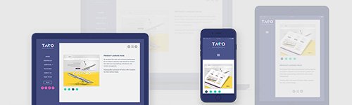
In this article I look into the options available to choose responsive layout for your product or website.
- Full responsive – Fluid
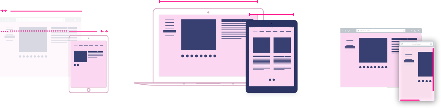
A fluid layout shows the content based on the available browser space by dynamically resizing the elements, regardless of the device or browser type. It’s a good choice if:
- No specific device type is targeted and 100% device compatibility is required
- A large audience needs to be supported
- User behaviour statistics and developer expertise are available for proper conceptualization
- Practical responsive – Adaptive
Changes the layout viewport width by viewport width, ensuring a more relevant content arrangement based on device type. A good choice if:
- A more tailored solution is required for the user’s situational capabilities
- There is a need to update the existing website but a complete rewrite is beyond the budget
- Greater control is required over how the design will look on different devices
- Non-responsive – Fixed
The fixed approach uses one preset page size for all displays, which will be cut on smaller screens and scaled down on mobile devices, allowing the user to zoom in. It’s a good choice if:
- The business has no online sales, and a brochure-type web presence is enough
- The website/interface is supposed to be used on a specific desktop screen
- Full control and pixel perfect implementation are required for proper functionality
In the next article, I’ll discuss the three dominant responsive development methods for a digital project to choose from.