The technical hurdles of creating proper responsive preview
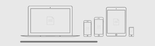
Creating responsive preview is all about seeing upfront what the clients would see when they check the otherwise responsively designed product on their own devices. The aim is to get as close as possible to the real life testing without building a device lab. Easier said then done. There are technicalities to consider, such as the followings:
-
- Pixel size
Checking mobile device previews on desktop can provide you with a slightly smaller or larger screen for the mobile devices in question than their real-life counterparts, depending on the physical pixel size of your monitor. Generally, larger display devices such as monitors and TVs have larger pixels and smaller display devices such as smart phones have smaller pixels.
The devices using smaller pixels produce higher quality or sharper images than those using larger pixels.
Let us examine our intuition about the relation of pixel size and image quality. Let’s suppose, that we have created a user interface optimized to a resolution of 1920×1080 on our 21.5″LCD monitor, and we want to see, how it looks like on a tablet with a 10.6″ screen, and on an LCD TV with a 60″ screen, both capable to the same resolution, to ensure ourselves, that the design looks the same on all of these devices. We’ll see, that our intuition in this case is indeed correct, and that the visual experience is quite different on these devices.
When it comes to ensuring the same visual experience, the truth is that we can pretty much have the same resolution, colors, and pixel layout, but not the same pixel size, nor the same display size.
- Device pixel ratio
The device pixel ratio is the value telling us how many pixels the device uses to display 1 reference pixel at the optimal viewing distance of the device. This value can be interpreted as the ratio of pixel sizes: the size of one CSS pixel to the size of one physical pixel.” Let’s take a closer look on these terms:
- Reference pixel: “The visual angle of one pixel on a device with a pixel density of 96dpi and a distance from the reader of an arm’s length. For a nominal arm’s length of 28 inches, the visual angle is therefore about 0.0213 degrees. For reading at arm’s length, 1px thus corresponds to about 0.26 mm (1/96 inch).”
- Physical pixel: this is the actual pixel used in the device screen.
- CSS pixel: also referred to as “logical pixel”, this is the size used in the definition of the reference pixel: 1/96 inch.
Most of the time, when we are tweaking CSS definitions, we can forget about the distance part of the reference pixel definition and focus on the CSS resolution, but have to keep in mind, that it is an important part of the definition.
Let’s take a smartphone for example, with a device pixel ratio of 2. If we forget about the distance part of the reference pixel, it is easy to draw the false conclusion, that the size of 1 CSS pixel equals to the size of 4 (2 × 2) physical pixels, even though 1 CSS pixel is actually displayed with 4 physical pixels on the screen.
It can very well be, that the 4 pixels of the smartphone are still smaller than 1 CSS pixel, unless we move the smartphone to its optimal viewing distance.
- Resolution
The most common way to express the image quality called resolution. By definition the resolution is the number of distinct pixels that can be displayed horizontally and the number of distinct pixels that can be displayed vertically. By convention these two numbers are separated by the letter “x”, e.g.: 1920×1080. We use these two numbers when we say that we “optimize the design to a certain resolution”.
Knowing the device pixel ratio also helps us to calculate the resolutions (and thus the optimal break points) to which we want to optimize the design of product or website. This resolution is also referred to as the “CSS resolution”, and can be calculated in both dimensions (width and height).

Let’s suppose a smartphone has the resolution of 720 × 1200 and its device pixel ratio is 2, then the CSS resolution in both dimensions is calculated like the following:
Width: 720 ÷ 2 = 360; height: 1200 ÷ 2 = 600
CSS resolution = 360 × 600.
- Scrollbar width
The browsers are very different in interpreting the width of the targeted display area of the output device. Chrome and Safari exclude the scrollbar from the viewport width (the area inside the browser window) while Firefox, Opera and IE include the scrollbar dimensions. That makes Chrome’s viewport width being in fact 820px (800px body + 20px scrollbar) not 800px hence can trigger a different media query.

Not just during development, but also during the responsive preview it is important to control the scrollbar width to ensure that the media query breakpoints occur the same way they do on real devices.
- Browser inconsistency
When setting up the responsive preview, it’s important to keep in mind that the default mobile browsers and the mobile versions of the most common browsers can be slightly different from their desktop counterparts in terms of applying style sheet declarations.