Responsive strategy 3: Mobile first or desktop first or element first
In the previous article of the Responsive strategy series, I’ve looked into what kind or responsive layout approaches are available for product or website, when would a fluid layout or adaptive layout or fixed layout be the best choice.

- Mobile first
A very focused approach that begins with designing for the main function and only then expand the functionalities for higher resolutions (often called progressive enhancement). It’s a good choice if:
- The number of mobile users is already 80% and above or 50%, but the sales are higher on mobile
- The experience needs to be optimized for mobile and merely functional on desktop
- The website/interface has only a few core features
- The type of service/product is rather interactive (entertainment, life-style, networking, news etc.)
- Desktop first
This means designing for the highest specifications – the best achievable – and then going down to smaller resolutions (often called graceful degradation). It’s a good choice if:
- Visitor numbers and sales are higher on desktop
- The website/interface is feature-rich, e.g. productivity, office or business tool
- The experience needs to be highly refined on desktop and merely functional on mobile
- The time and budget are limited, but patches are required for the existing product
- Element first
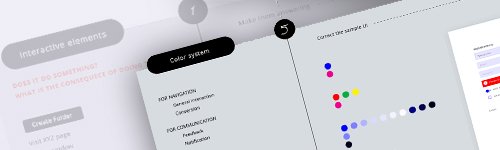
This approach is often referred as atomic design applied with a responsive mindset, and it enables the individual preparation of the interface elements so they behave responsively regardless of the layout. It’s a good choice if:
- The number of hits is close to equal on mobile and desktop or there are no initial user statistics
- The website/interface is feature rich and complex and will expand gradually over time
- Sufficient time and budget are available to build a future proof design system
With this Responsive strategy series, I’ve collected the main considerations around how to go about multi-device online presence. Knowing what factors to assess when preparing for a product or website development can save you from changing strategy afterwards, which is an extremely costly move.