
Practical analysis of the ‘slow and painstaking’ work behind the ‘fast and easy’ interfaces
At some time in their career, every interface designer get to the point of trying to create one of those ‘fast and easy’ interfaces that most of their companies are already advertising. The design reality is that what is fast and easy on the visitors’ side is slow and painstaking on the designers’ side.
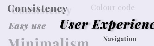
The reason behind this is that ‘fast and easy’ is based on patterns that are embedded in a matrix of functionalities in which all of the elements are part of the system and all together forming a model that is optimized to the target audience’s metal model, hence reducing the cognitive efforts required for usage. Does this sound ‘fast and easy’ to create? It does not. This is a gigantic work even with pre-approved specifications and a fixed set of functionalities to display, which is quite rare in a real-life environment. The question here is, how to manage a living, breathing system that can change as it is built. How to choose, style and place the elements in a flexible way that is, at the same time, not too loose to lose the coherence between the elements?
When working towards the marketability of an interface, I start with grouping the elements to see what I have and what they are good for. I usually create four main groups. Each of them has a core aspect that indicates how they should be treated. The groups are:
- Interactive elements
includes: buttons, links, input fields, switchers, slider controls …
This is the most important group because these are the elements that carry the functionality of the platform. What the visitors can do on the page, what functions are available and basically the entire business goal is conveyed via the interactive elements. Their affordances define how feature-rich or feature-poor the platform is perceived to be. If visitors cannot find a certain function because it’s hidden or placed other than where it is expected, the conclusion is that the platform doesn’t have that function. Considering the operational cost of developing each functionality, this lack in affordances can mean several hundred thousand dollars/pounds/euros going down the drain.
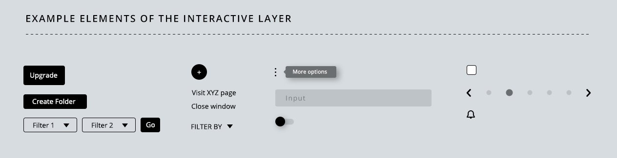
Extended explanation on the Interactive UI elements
- Supportive elements
includes: icons, graphics, images, dividers, white spaces …
Supportive elements are there to improve the understanding of other elements or the layout itself, not to promote themselves, hence they cannot be as loud or dominant as the interactive elements are. That is, they can’t compete with the interactive elements for visibility; otherwise, they would hijack the users’ attention. They there to help the user to figure out quickly what an interactive element is or what a section is about. If they trigger the question: ‘What is it?’, then they were either chosen incorrectly, placed incorrectly or are just plain wrong. When chosen well, they create a quiet background for the interactive elements, helping them to convey the value of the platform to the visitors.
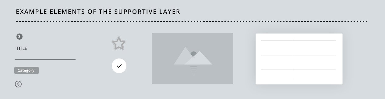
Extended explanation on the Supportive UI elements
- Textual elements
includes: headlines, paragraphs, meta data, labels, system messages, microcopy …
The textual elements can be a very engaging group of assets if done right because we communicate ideas and thoughts in writing in a very similar manner to how we convey these things in a live conversation: with words and tone. A live conversation is very translatable into written textual content using the right words and right font styling. One main difference though is that conveying emotions and humour in writing is done using a quite limited toolkit. Visitors are not provided with gestures, facial muscle movements or voice pitches. As a result, in some cases, efforts to make the text ‘cool’ often end up alienating the visitors due misinterpretations. That is, you might call them Dude to create a friendly, like-minded atmosphere that you might create with a wink in a real-life situation, but there might be a late-thirties, seasoned professional reading the page feeling a bit mistreated by being called Dude. Generally, everything that requires gestures or context to be taken as intended needs to be avoided in writing.
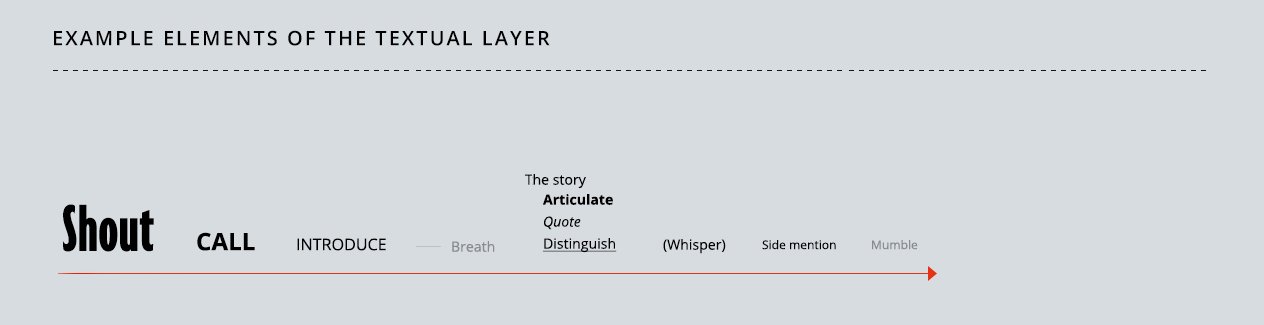
Extended explanation on the Textual UI elements
- Colour system
includes: interaction colours, navigation colours, decoration colours, function colour-coding systems, common region colours …
My favourite group. Unfortunately, everyone else’s favourite, too. Colours are the undisputed king of the visual language. The loudest and psychologically probably the most deeply-rooted visual assets we have along with shapes. Due to their powerful nature, building a system with colours requires careful attention and extended visual practice. Otherwise, you might end up with an interface that looks like a children’s colouring book. To use colours as a core navigation tool, they need to be picked with purpose, derived from the core colour (brand colour) and used consistently throughout the entire platform.
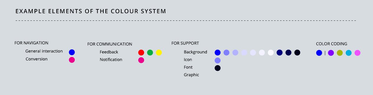
Extended explanation on the UI Colour system
These layers, when tailored together properly create the core matrix of the interface. Every further decision is rooted in the ones that were made when creating this base model, leaving very little room for later guesswork. Ideally, colours are not picked by likes, elements are not labelled according to trends and buttons are not placed by experiment. Hence, ‘fast and easy’ interfaces are designed using this ‘slow and meticulous’ approach while applying a long line of research in behavioural psychology and material design. The result is an engaging interface and a long term emotional connection with the users, that ensures an ever-growing number of habitual users and strong recurring revenue.
Start practicing the use of these UI elements for intuitive interface design →


Teodora
You really make it seem so easy with your presentation but I find this matter to be really something which I think I would never understand. It seems too complicated and very broad for me. I am looking forward for your next post, I’ll try to get the hang of it!
JamesOnix
Many thanks, this article is very practical.