
Pitching design interactively – the options to present the design on multiple devices
I’ve looked into what are my options for live design presentation on multiple devices. Why did I need that? Well, I did because my clients want a 360 degree overview on how the product would look like on their customers’ side. Reasonable, their revenue depends on that. So I always aim to present a comprehensive view of the design I’ve created, preferably with interactions offered to the client.
What are my options:
- Developer toolbar’s responsive preview
- Browser add-ons
- Free mobile site testers
- Do my own thing
When do can I use a developer toolbar or a browser add-on for design preview?
Generally speaking, if I need to show the test result to internal people, colleagues or connection that is familiar with the product design process, these tools are fine. The view won’t be too polished and there are technical setting but it doesn’t have to be polished or comprehensive. They’re quite convenient responsiveness testers for ongoing design or front-end development works, since I just grab the side of the panel and drag it left and right to change the responsive view. I can’t expect pixel perfect accuracy, but during the development stage I don’t really need to worry about accuracy. Basically, I just need to show how the layout and the responsive breakpoints correctly.
When can I use a free responsiveness testing tool?
After a certain point I need to be able to measure or have at least a grid view of the resolutions assigned to a certain device type to know what to correct and how to correct that in the layout. If I also want a quick look on different devices, rather than a flat screen sketch, I have several options for that, too, based on the purpose.
There are a few tools with rules for measuring, such as quirktools.com/screenfly, designmodo.com/responsive-test.
The most common mobile responsive testers with some form of device preview include ami.responsivedesign.is, responsivedesignchecker.com, websiteresponsivetest.com, responsive.pixeltuner.de, responsinator.com and lab.maltewassermann.com/viewport-resizer/ with quick resize still freely available.
What about premium responsive design tools?
There are two aspects of testing mobile responsive sites that require professional tools. One is usability and the other one is presentability. If you do design pitching often, you have to be able to do it very efficiently and in the appealing way. Professional tools give you the interface prepared for a quick and accurate responsive overview. For that stage the pixel density would useful to be applied to get an accurate responsive view. What is also very important for design responsiveness reviews and client presentations, but unfortunately rarely available, is the real device image applied around the screens that ensure accurate visual adjustment.
For an efficient mobile responsive test there is sizzy.co which is a mobile only responsive browser for developers. But I’m not a developer and I need the preview for client presentation.
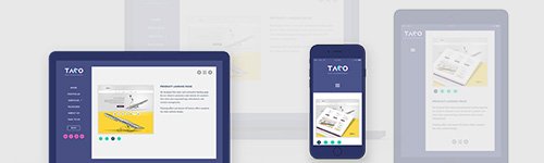
That’s how I got to do my own thing.
Basically me and some friends decided to pull off an interactive client presentation tool to share responsive design in an easy to understand and convincing manner. That is ondevice.app, that makes our design pitch multi-device, literally.


Gabriel
Hi, When this tool would be available? I’ve checked the site and it says soon but no date.
Julianna Sudi
Hi Gabriel, thank you for asking, OnDevice will be available around late spring/early summer 2021!