Responsive strategy 1: Native app or dedicated mobile site or responsive website
Responsive strategy 1: The platform
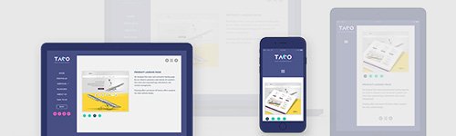
Knowing what factors to assess when planning a responsive online experience is crucial to stay in budget, leverage the available technology and get the most out of the marketing efforts. In this first article of the Responsive strategy series, I’ll go through the aspects of choosing the right platform for your responsive presence. When would a native mobile app, a dedicated mobile site or the responsive website be the best choice?
- Mobile App
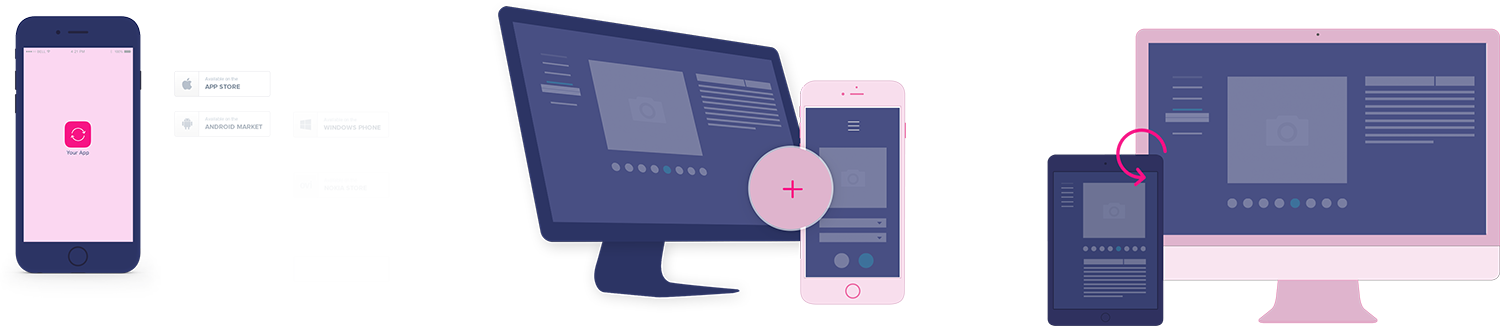
By definition a mobile app, as a downloadable application, is providing a highly personalized mobile experience for the purpose of driving engagement from loyal customers. It’s a good choice if:
- The website / interface is very interactive
- Your target users are trend sensitive impulse shoppers with high brand awareness
- A mobile’s native functionalities are required (calendar, notification, GPS etc.) for the full experience
- You can afford a long term commitment to maintain and market an individual app
- Dedicated mobile site
A dedicated mobile ist is an ‘m.domain’ website accessible by redirecting users from the main site, created exclusively for targeting mobile users with tailored content. It’s a good choice if:
- The business has a high number of online sales and needs a quick solution to reach a wider audience
- Time and budget are limited, but a mobile version is required for the main function
- A temporary solution is required until the legacy codebase is converted into a new web presence
- The marketing budget is limited and it is necessary to leverage the main site’s traffic (searchable, shareable)
- Single (responsive) website
A single responsively designed website can be built on a versatile layout to be allowed for viewing on various mobile devices and screen sizes (one site fits all). It’s a good choice if:
- Sources allow the maintenance of only one codebase and the advertising of only one domain
- The service/product is general, and there is no need for a fully mobile-centric user experience
- No statistics are available for mobile usage
- The site needs to be compatible with all device types
In the next article, I’ll discuss the aspects of choosing fluid layout or adaptive layout or fixed layout for the product or website.